How can a large international organization effectively address the challenges faced by multiple teams in various countries within the innovation and IT sector… simultaneously? Wait, what? Can you imagine the meetings about this? Getting confused and frustrated already? Well, I did and I wanted to do something about it. I created illustrations to get to the core of problems quicker, simplify complexity, uncover hidden agenda’s, an have less and shorter meeting. They worked.
PROJECT DURATION CONTINUOUS, 2,5 YEARS.
CONTEXT CORPORATE, INNOVATION & IT DOMAIN
DELIVERABLE MANY ILLUSTRATIONS THAT ARE USED ON THEIR OWN OR IN POWERPOINTS
IMPACT GETTING TO THE CORE OF PROBLEMS QUICKLY, EASILY ONBOARDING STAKEHOLDER, LESS MEETINGS
Illustrating to bring ideas alive
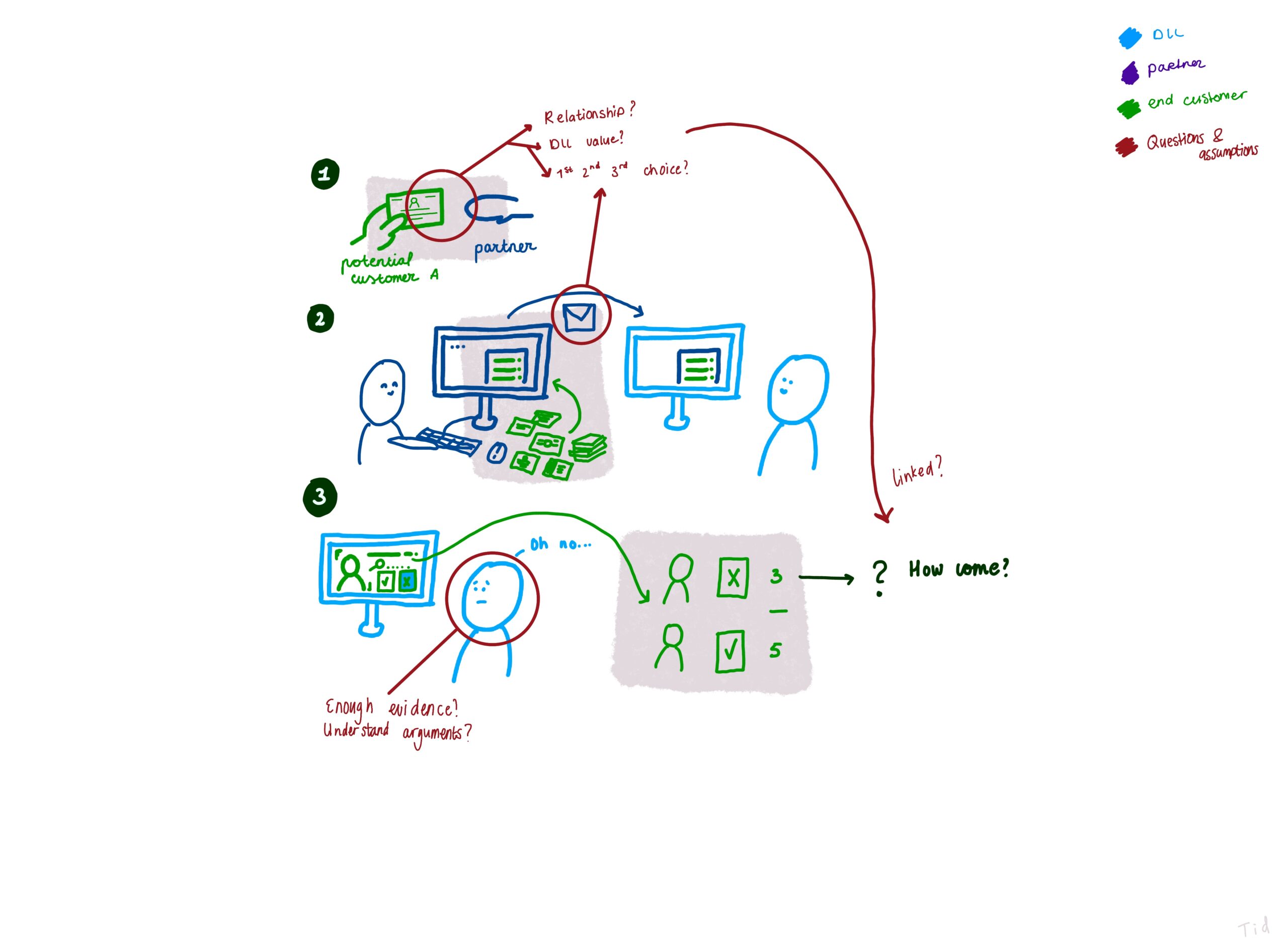
In my experience, too many brainstorms and discussions continue to rely mostly on verbal communication or become a mess of post-it notes, resulting in the loss of valuable ideas. As a visual thinker, I find that illustrating helps me to actively participate in conversations and avoid confusion. I initially began using illustrations to verify my understanding of what was being said, but soon realized its potential to steer the conversation and get to concrete solutions. With everyone on the same page, it became easier to identify and address any misunderstandings, as they could be clearly represented through my visuals.
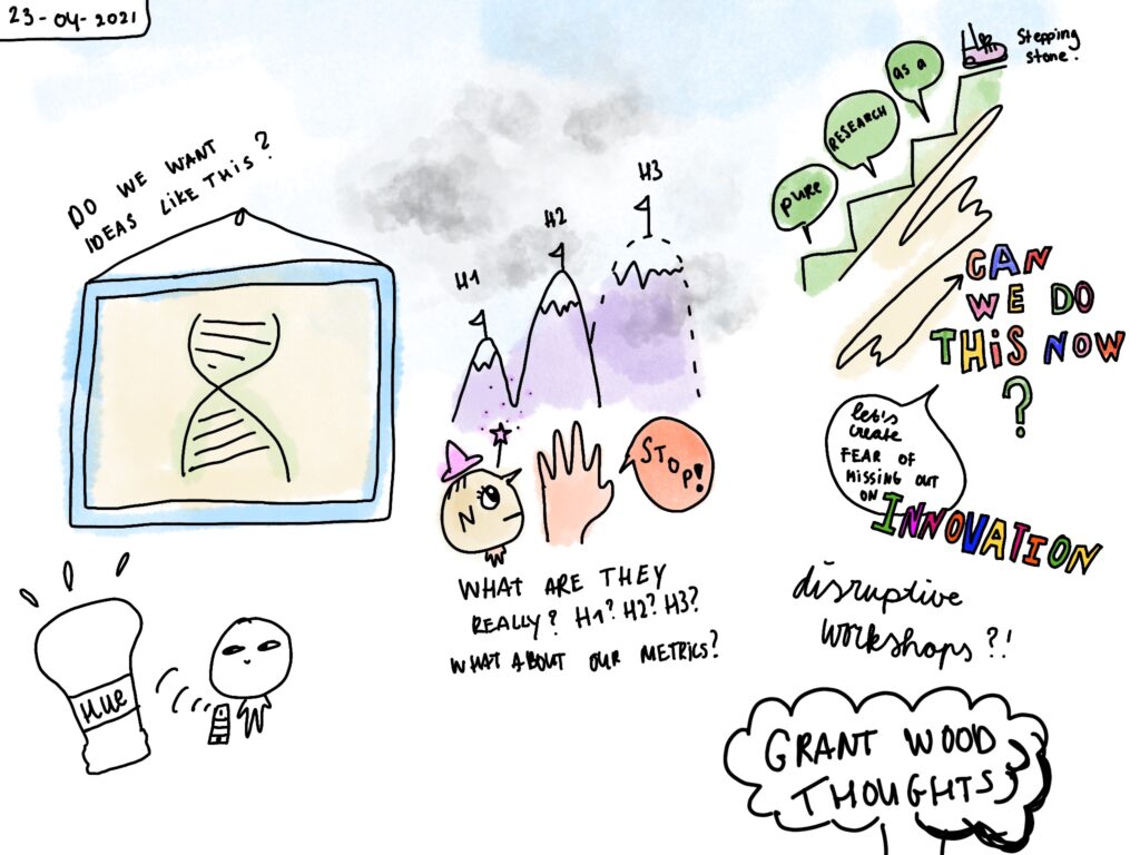
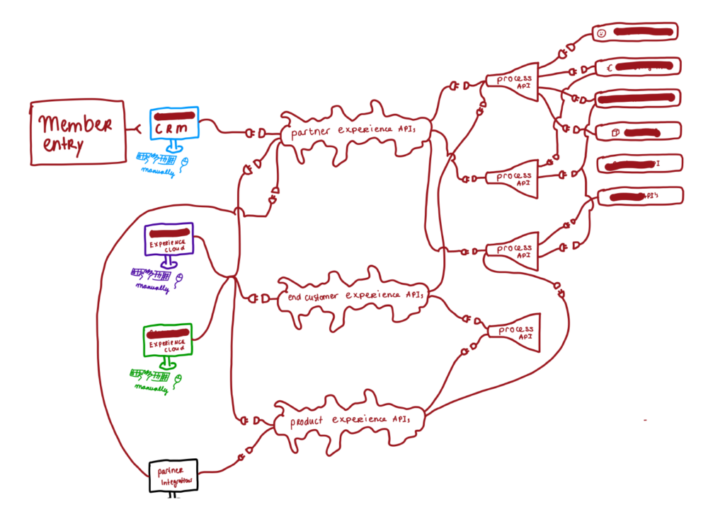
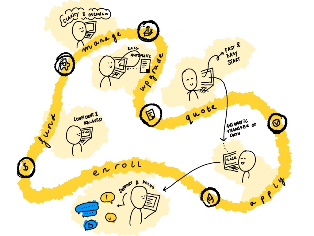
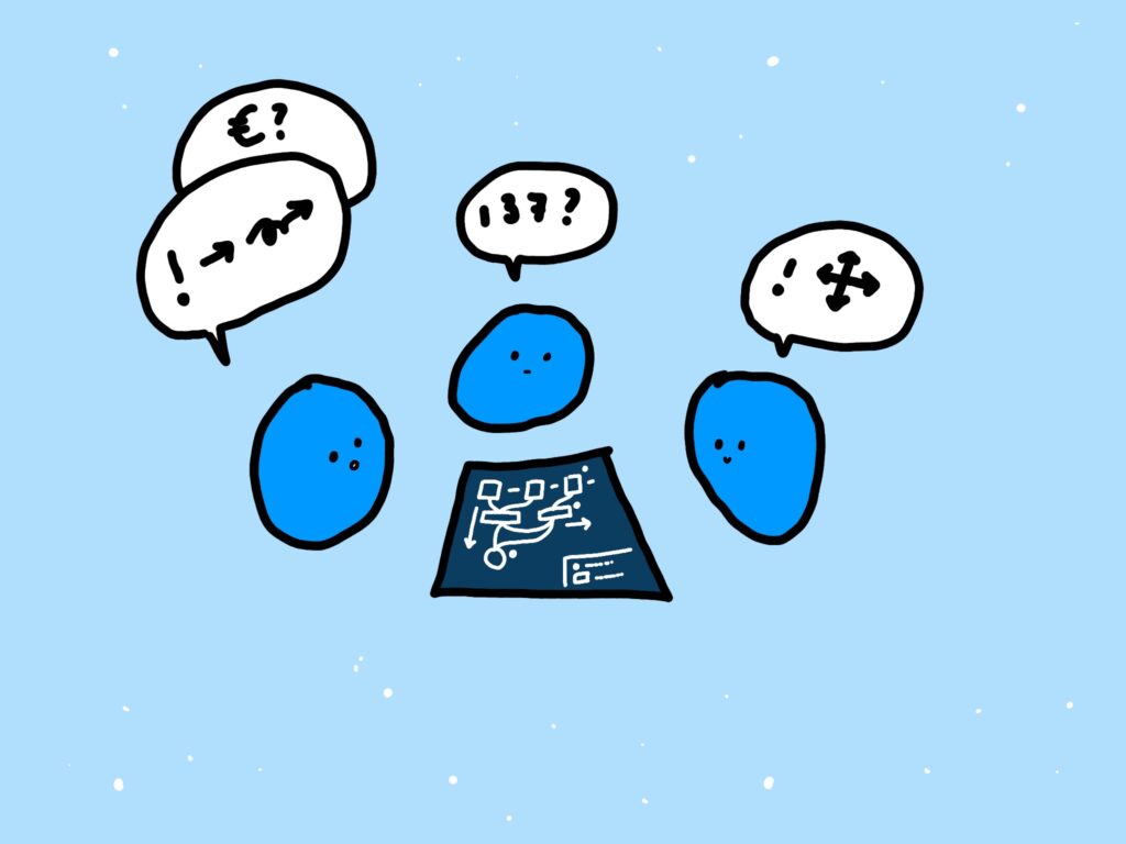
Illustrating to get to the core
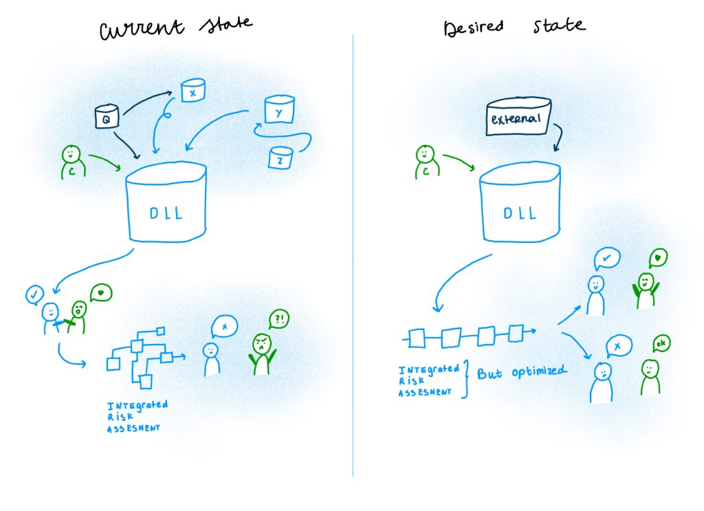
As I grew more comfortable in illustrating and using my work in meetings, (mind you, these illustrations were very much out-of-the-box for my corporate ‘audience’), it became a great tool to get to the core of problems. My illustrations ended up in all kinds of places and were used for different purposed: in innovation projects, strategic documents for the Executive Board, IT discussions, Digital Transformation, Enterprise Architecture. Heated conversations cooled down, super confusion IT jargon became super simple and visual, and we were all working towards solving the same problem.
Illustrating to get people to empathize, adding my designer lens
There is one specific element of my drawings that is essential in all: they show people with emotions. Anyone was able to empathize with the person I’d drawn, whether they knew them or not. No more overfilled PowerPoints with lots of text about the problem, yet never show who’s being impacted by the problem and what they feels like. The empathy part matters and silences ego’s because, if the end-customer is looking really upset, it can’t be ignored.
